
Accessible Design for print
What is Accessible Design?
All design, by definition, should be aiming for accessibility. Designers, or at least those focussing on both form and function, work hard to make printed materials clear and legible, websites navigable, and products easy to use.
“As a profession, we’re committed to providing easier access - to information, to ideas, to public spaces - through smarter, more effective communications engaging the widest possible audience”
Accessible Design - which simply means design that is clear, legible and easy to understand for all, including those with disabilities - is gaining in popularity as people become more aware of inclusivity.
For many of our clients, such as those in the educational and disability sectors, accessible design is now a requirement, and for good reason. As the populations of schools, universities and businesses become more diverse, it’s important to cater for the needs of all, and recognise that everyone has a right to access information.

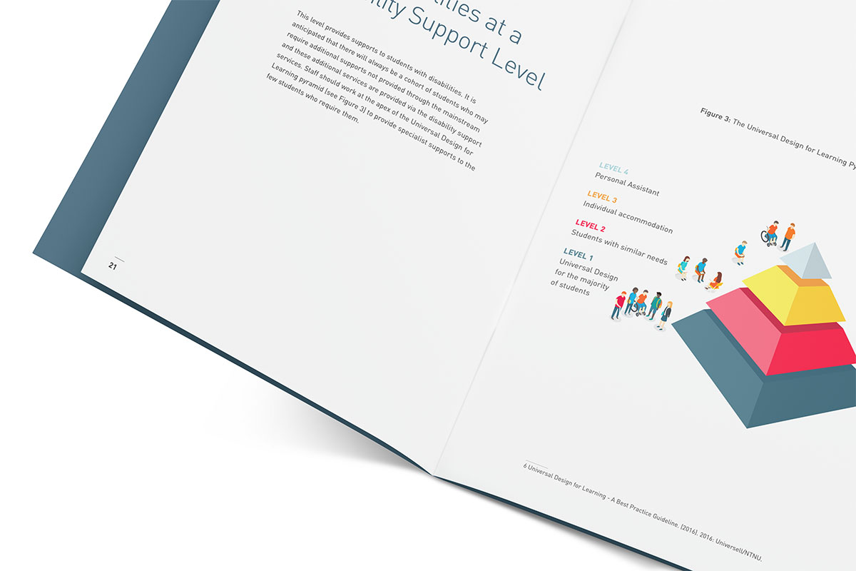
This publication for University College Dublin deals with the subject of inclusion, and required an accessible design incorporating the tenets of Universal Design for Learning.
According to the World Health Organization, it’s estimated that about 15% of people worldwide have some form of disability, and as the population ages, factors such as legibility gain greater significance.
While there are requirements for compliance in certain sectors, the adoption of Accessible Design this leads to a wider question:
"If we’re designing conscientiously for the needs of a specific set of people, aren’t we in fact learning how to design better for all?
AHEAD are a non-profit dedicated to helping people with disabilities thrive in education and the workforce. Our work for AHEAD always feature accessible design.
What elements make print designs accessible?
Grid
A grid - typically a series of columns that split a page into a number of fields - is a basic element of graphic design, and can be clearly observed in newspapers and magazine layouts. While experimental designs can play with or break a grid, for Accessible Design, consistency is important, and a clear, coherent grid running throughout the document can act as a signpost to identify content and process meaning.
Hierarchy
Visual hierarchy refers to the arrangement of elements in a way that reflects their importance. A simple application would be using consistent larger headings, sub-headings, or numbered sections to break content into a logical order.
Paper type
One factor that easy to overlook is paper stock. However, it’s important to consider as the glare from shiny gloss paper can make documents, particularly text-heavy ones, more difficult to read. When sending documents to print, be sure to request matt paper stock, particularly for digital printing which uses smoother papers.
Background colour
Black text on bright white paper can cause the text to appear to ‘sparkle’, particularly for those with impaired vision. Using a pale coloured background, such as a very light grey as opposed to a bright white, can increase the legibility of text.

In this book we designed on Universal Design for Curriculum Design for Dr. Lisa Padden, a very light grey background on text pages increases legibility
Colour contrast
While the incidence of colour blindess is about 5% (affecting more men than women), perception of colour can be affected by many factors, including age.
A good rule of thumb is to aim for at least 70% contrast between elements such as background and text. Turning a monitor to grayscale, or printing to a greyscale printer can give a good indication of contrast - if elements appear to blend together, adjust contrast accordingly.
Font size
The go-to suggestion for accessibility is to use larger type. While a typical size for type in print would be 12 point, organisations advocating for those with visual impairments can recommend sizes of anywhere from 16 - 24 point for body copy. While this may seem like the obvious solution, it has knock-on effects, such as the amount of real estate needed to accommodate larger type, which will increase the number of pages and therefore the print and environmental cost of the document.
Font design
While type size is important, it can be a blunt instrument, and there are other factors that affect legibility.
Font shape/weight
The most legible fonts are well balanced - they don’t have very thick or thin strokes, unlike some more decorative decorative typefaces.

This typeface, while beautiful, is used in this context for its aesthetics, rather than its accessibility. The strong contrast between the heavy and light strokes of the letter make it less legible than a more balanced typeface.
Font scale
Beyond the point size that you choose, the scale of the letterforms themselves, which varies from font to font, has a huge impact on legibility. Getting nerdy about it, the main factor to consider is what’s called the ‘x-height’ of the font. The x-height is the height of a lower-case x in that font. Typefaces with tall x-heights are generally more legible than those with lower x-heights.

The x-height of a font - the height of a lower case letter x - affects its legibility. Typically, the larger the x-height, the easier it is to read.
As you can see in the example below, even at the same point size, two different fonts can be very different in terms of their x-height. By choosing a font with a taller x-height, you don’t have to increase the point size to the same extent. This is particularly relevant for main body copy, where the point size will have an impact on the length of the entire document.

Both of these fonts are at the same point size - 12 point - however the one on the left, Gotham, has a taller x-height, making it more legible.
Style
Most fonts can be divided into two main categories - display fonts, which are more decorative, and text fonts, which are designed for readability. When designing for accessibility, it makes sense to choose less decorative, more standard fonts with recognisable letterforms. This is not to say that all display fonts are to be avoided, but care must be taken that they are adequately large and legible.

An example of a text font - Gotham - versus a display font - Autumn. While display fonts can add visual impact, depending on their design they can impact legibility.
Line length
We touched on this point above, but the width of columns of text, and therefore the number of words per line, has a significant impact on readability. If columns are too narrow, many words will have to be awkwardly hyphenated, and readers can’t take in a decent amount of content on one scan.
Where line lengths are too long, the eyes have difficulty finding the start of each new line of text. A rough rule of thumb is to aim for about 13 - 15 words per line. You’ll notice than many articles (including this one) don’t take up the entire width of the web page, and this is the reason why.
Spacing
While every aspect of spacing, from spacing in between individual letters (kerning), to the spacing between all letters (tracking) can be adjusted, for the most part, sticking with the default settings of a well-designed font will ensure accessibility.
The main factor to consider is leading or line spacing - the vertical distance between lines of text. If line spacing is too tight, the top and bottom of letters, such as the lower part of the letter y or the upper part of the letter f (ascenders and descenders) can overlap, while if line spacing is too loose, it can be difficult for the eye to locate the start of each new line of text. A standard line height would be about 120% of the point size - so for example, 10 point text and 12 point line spacing.
Alignment
For a Western audience, left-aligned text is most familiar and therefore most legible. Aligning large blocks of text to the right or to the centre will compromise readability and should be avoided. Also, justified text, though popular, is less legibile than ‘ragged’ text (such as in this article) where each line length varies. The differences in the length make it easier for the eye to jump from line to line.
Capitals
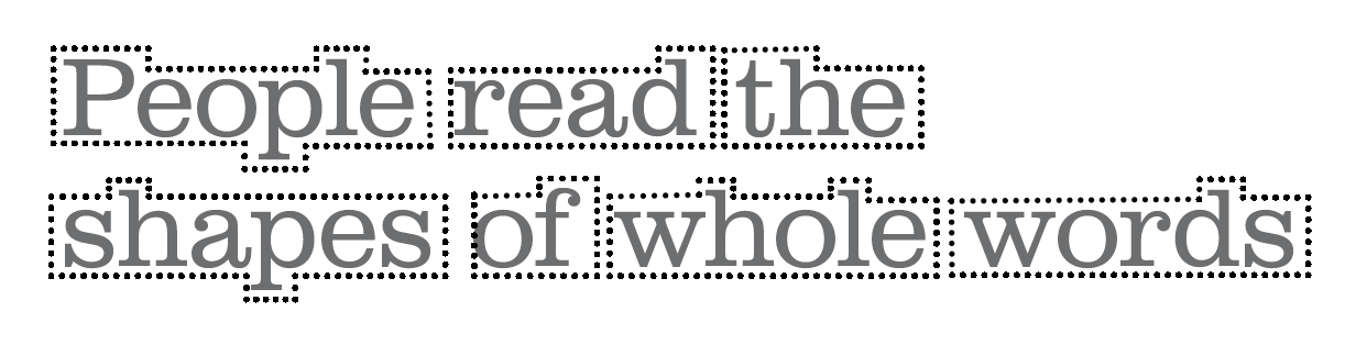
While it might seem that capitals would be easier to read that upper and lower case, the opposite is true. This is becasue the eye reads the entire outer shape of the word. You’ll notice that airport signage always uses upper and lower case letters for that reason - a word set all in capitals creates a rectangular silhouette that is harder to decipher. Similarly, italics or underlining should be used sparingly.
Source: RSAG
Well done if you’ve made it this far! While the intent here is to share some best practise for both clients and designers who care about accessibility, it’s important to remember that the above should be used as guidelines, rather than stringent rules. There is always some space for interpretation and individuality in great design - it just shouldn’t come at the cost of inclusiveness.
“Design is where science and art break even”
- Robin Matthew
Sources:
AccessAbility: A Practical Handbook for Accessible Graphic Design - RSAG
Universal Design for Curriculum Design - Dr Lisa Padden, UCD